Understanding p50 p75 p90 p95 and p99 latency metrics
These terms are typically used to describe latency metrics—how long it takes for a system or service to respond to requests. The numbers like p50, p75, p90, p95, and p99 refer to percentiles, which give you a better sense of how the response times are distributed.
Let’s break it down using an everyday example.
Example: Measuring Latency in a Restaurant
Imagine you’re at a busy restaurant, and you want to know how long it takes for people to receive their food after ordering.
Latency: This is the total time from when you place your order to when the food is served.
The Percentiles (p50, p75, p90, p95, p99)
- p50 (50th percentile): This is the median—half the people get their food faster than this, and half the people wait longer. Example: Out of 100 customers, 50 people get their food in less time than this, and the other 50 wait longer. So, if p50 = 15 minutes, it means that half of all the orders are served in 15 minutes or less.
- p75 (75th percentile): This is the point where 75% of the people get their food faster than this, and 25% of people have to wait longer. Example: If p75 = 20 minutes, it means that 75% of the people got their food in 20 minutes or less, and 25% waited longer.
- p90 (90th percentile): This means 90% of the customers got their food in this time, and 10% waited longer. Example: If p90 = 25 minutes, 90% of customers were served in 25 minutes or less, but 10% had to wait longer.
- p95 (95th percentile): This is similar to p90 but for an even higher percentage—95% of the people were served in this time, and 5% waited longer. Example: If p95 = 30 minutes, it means 95% of people got their food in 30 minutes or less, and only 5% waited longer.
- p99 (99th percentile): This is the top 1%. It’s the maximum time that still only 1% of people had to wait longer than. Example: If p99 = 40 minutes, it means 99% of the people got their food in 40 minutes or less, and only 1% waited longer.
Putting It All Together
Let’s assume the following values for a busy restaurant:
- p50 = 15 minutes
- p75 = 20 minutes
- p90 = 25 minutes
- p95 = 30 minutes
- p99 = 40 minutes
These values give you a sense of how most people are being served and how much the slowest people are waiting:
- 50% of people are being served in 15 minutes or less.
- 75% of people get served in 20 minutes or less.
- 90% of people are served in 25 minutes or less.
- 95% of people are served in 30 minutes or less.
- Only 1% of the people had to wait longer than 40 minutes.
Why It’s Useful
If you look at p99, you can see that there’s a small group of people who experience much longer wait times. In a tech context, that means a few users might experience much worse latency than most of the others, and you might need to work on improving the system for that small group.
p50 (median) and p75 are often used to see how the majority of users are experiencing the service.
So, these percentiles help you understand not just the "average" wait time but how the system performs for different parts of the population, especially when there are some outliers (very slow responses).
Example Query
fields @timestamp, request_type, duration_ms
| filter request_type = 'inbound'
| stats pct(duration_ms, 50) as p50_latency, pct(duration_ms, 95) as p95_latency, pct(duration_ms, 99) as p99_latency by bin(1m)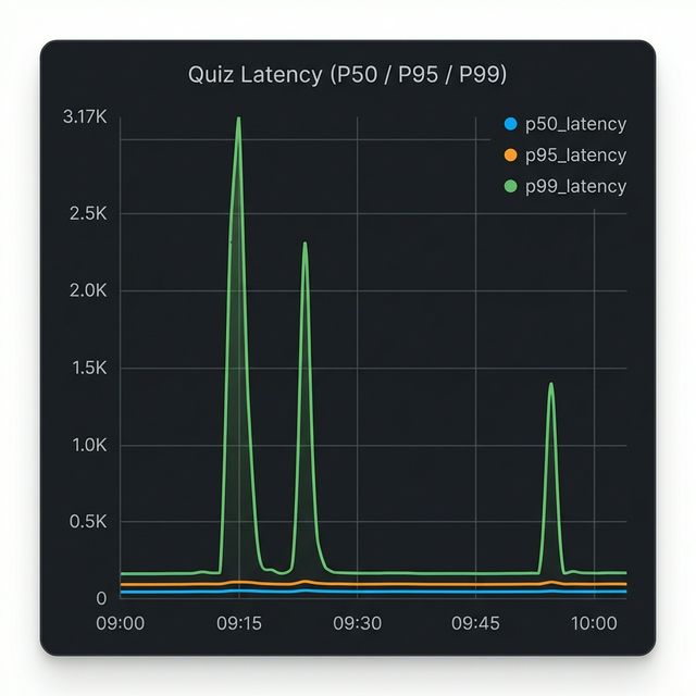
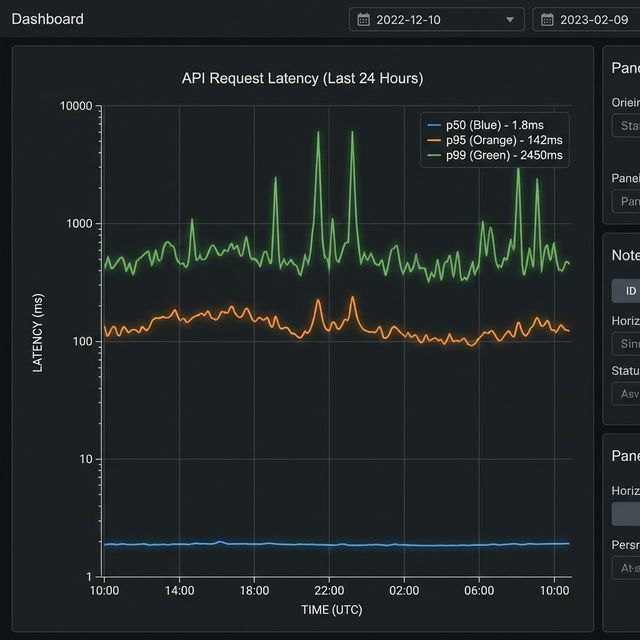
Visualization: CloudWatch Logs Insights Graph
This CloudWatch Logs Insights query is producing the graph you're seeing above, which shows latency percentiles for inbound requests over time.
The Query Breakdown
fields @timestamp, request_type, duration_ms- Extracts the timestamp, request type, and duration fieldsfilter request_type = 'inbound'- Only analyzes inbound requestsstats pct(...) by bin(1m)- Calculates three percentile metrics grouped into 1-minute intervals
What the Graph Shows
The three lines represent different percentiles of latency:
- Blue (p50_latency) - The median: 50% of requests are faster than this
- Orange (p95_latency) - 95% of requests are faster than this
- Green (p99_latency) - 99% of requests are faster than this (the slowest 1%)
What Your Data Reveals
Looking at the graph, you can see two significant latency spikes:
- Around 09:15 - p99 latency spiked to ~3,170ms (over 3 seconds)
- Around 09:25 - Another p99 spike to similar levels
- Around 10:00 - A smaller spike to ~1,400ms
Notice that:
- The p50 (blue) stays near zero throughout, meaning most requests remained fast.
- Only p99 (green) spikes dramatically, indicating these were tail latency issues affecting only the slowest 1% of requests.
- p95 (orange) barely moves, suggesting less than 5% of requests were impacted.
This pattern typically indicates isolated issues (like occasional database slowness, cache misses, or specific expensive queries) rather than systemic performance degradation.
Actions to Take by Percentile
When you see spikes in specific percentiles, here is where you should look:
- High p50 (Median): If your median latency is high, your entire system is slow for
everyone.
- Action: Look for global bottlenecks. Upgrade infrastructure (CPU/RAM), optimize core business logic, check for missing database indexes, or investigate network latency.
- High p90 / p95: Most users are fine, but a significant chunk is suffering.
- Action: Investigate specific heavy endpoints or distinct user patterns. Implement caching (Redis/Memcached) for expensive operations. Check for database locking issues or uneven load balancing.
- High p99 (Tail Latency): Only a few users are affected, but often severely.
- Action: Look for "outliers" and edge cases. Common culprits include:
- Cold starts: (e.g., Serverless/Lambda functions waking up).
- Garbage Collection (GC) pauses: (especially in Java or Go).
- External Timeouts: A 3rd party API call hanging for a specific request.
- Data Skew: A specific user with 10,000 items in their cart when most have 5.
- Action: Look for "outliers" and edge cases. Common culprits include:
The "Long Tail" of Latency
Another way to visualize this concept is through a distribution histogram. Most web requests are fast (the tall bars on the left), but there is a "long tail" of slower requests stretching to the right.
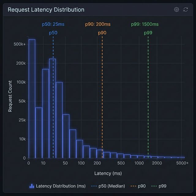
Visualization: Latency Distribution & The Long Tail
In the histogram above:
- The Peak (p50): Most requests cluster around the left side, representing the typical, fast experience.
- The Tail (p90 - p99): As you move right, the bars get shorter but extend far out. This is the "long tail." Even though these bars are short (fewer requests), they represent users waiting significantly longer (10x or 100x the median time). Monitoring p99 ensures you don't ignore this tail end of user experience.